Identity
As an existing part of the Carl Friedrik brand identity that has a modern feel and is instantly recognisable among customers, we set about updating and evolving the logo, rather than giving it a complete overhaul.
Subtle tweaks include adapting the curvature of the ‘R’, reducing the spacing between letters to give a more harmonious feel and adjusting the weighting between ‘Carl’ and ‘Friedrik’.
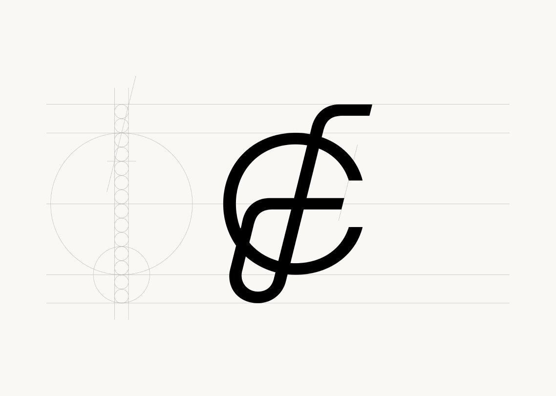
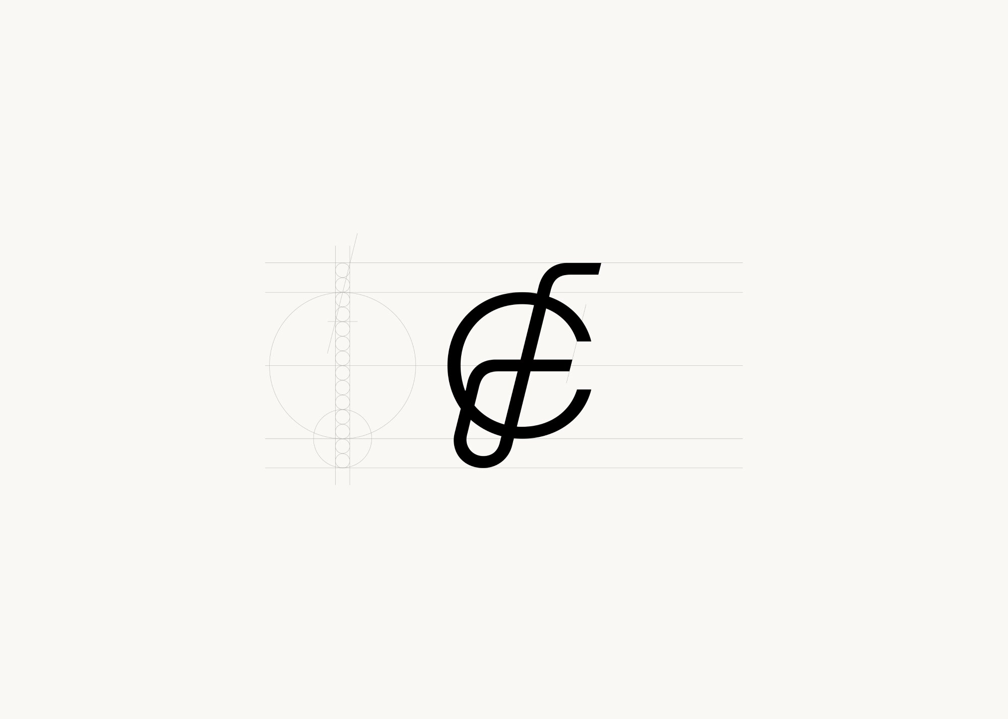
With the monogram, we aimed to create a long-lasting and memorable symbol that customers would come to naturally associate with Carl Friedrik. Capturing our commitment to timeless design principles, the interloping ‘C’ and ‘F’ letters convey engineering and precision, whilst retaining an aura of elegance.
The geometric form, with minimal ornamentation, also hints at turn of the 20th-century modernism. Here there are clear synergies with our pared-back design ethos.
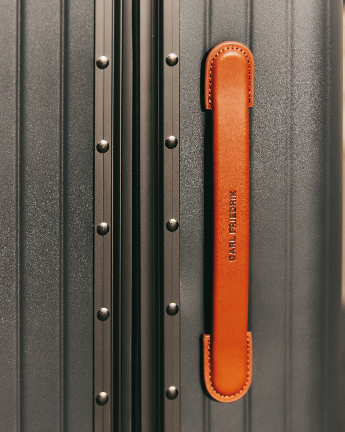
Rust is a sophisticated and earthy tone that felt like a natural fit as our new primary colour. While many brands favour neutral and muted shades, we chose this warm red because it has a welcoming and enticing feel that encourages a more intimate customer experience — whether online on the site or in person.
Not only that, but Rust’s earthiness corresponds with the natural materials we use across the collection. Case-in-point is the organic vegetable-tanned leather that the Heritage bags are made from
The Check-in
A modern sans-serif typeface, Founders Grotesk represents a contemporary interpretation of classic grotesks. These earlier versions were often used in London’s pre-20th-century print industry, so there’s a subtle nod to our roots as a London-based brand.
Founders Grotesk pulls the original characters into the future, with open apertures and large x-height giving it a clean and legible feel. The precise yet eccentric forms introduce character and a point of differentiation to a market saturated with simple fonts and unimaginative page layouts.
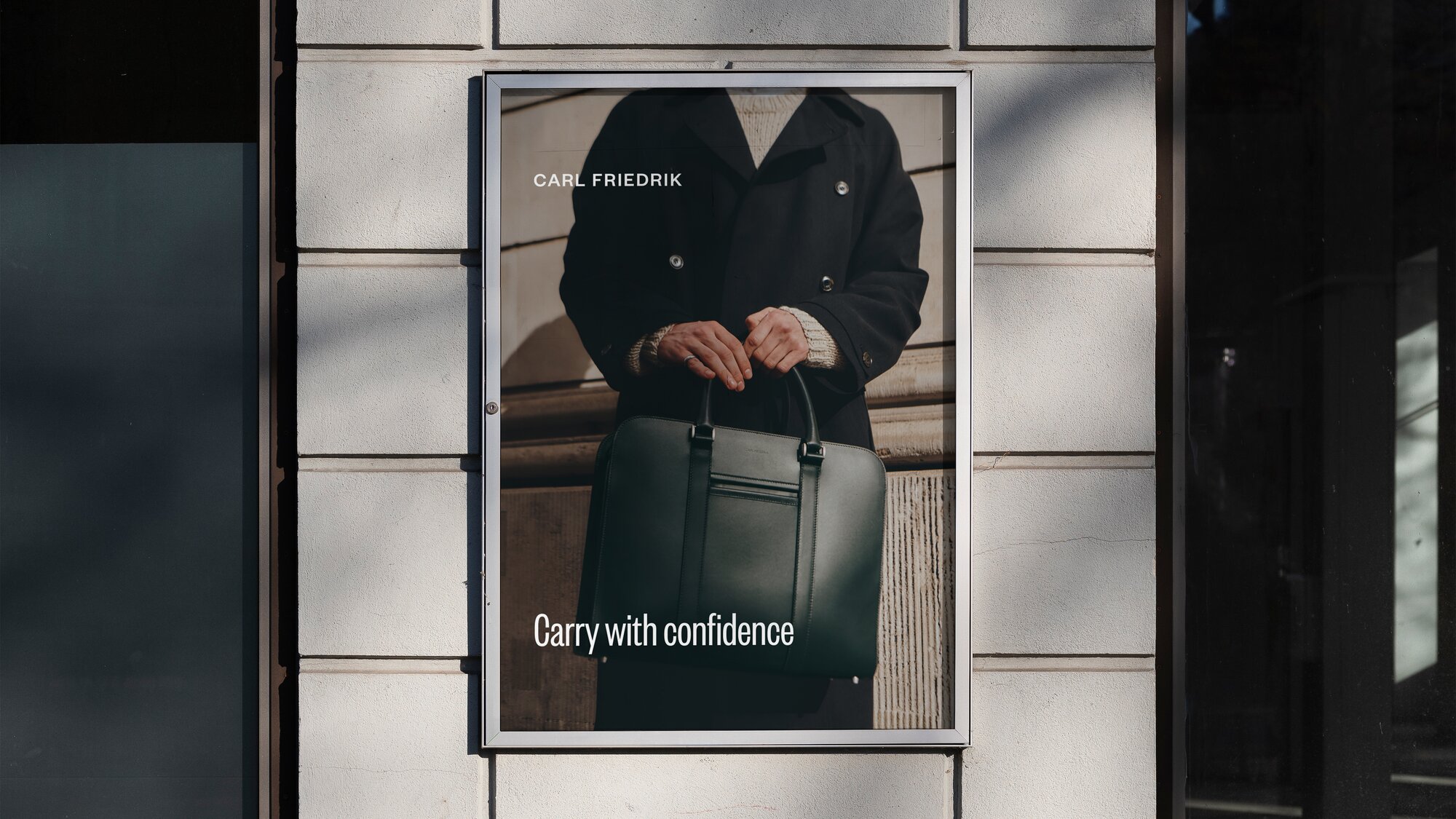
The overall result is a timeless and confident typeface that makes an impact, capturing our unique approach to travel (‘Carry with confidence’). For a modern travel lifestyle brand, it’s an ideal fit.

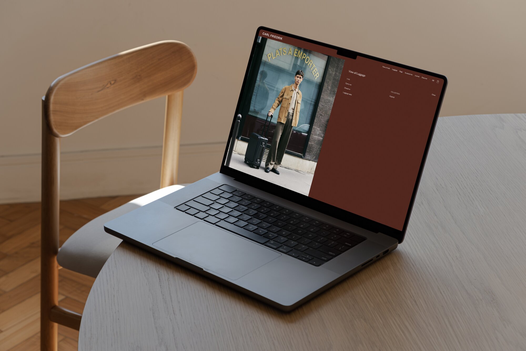
Website design
While the updated elements of the brand identity are used across the website, the experience itself has also been wholly reimagined.
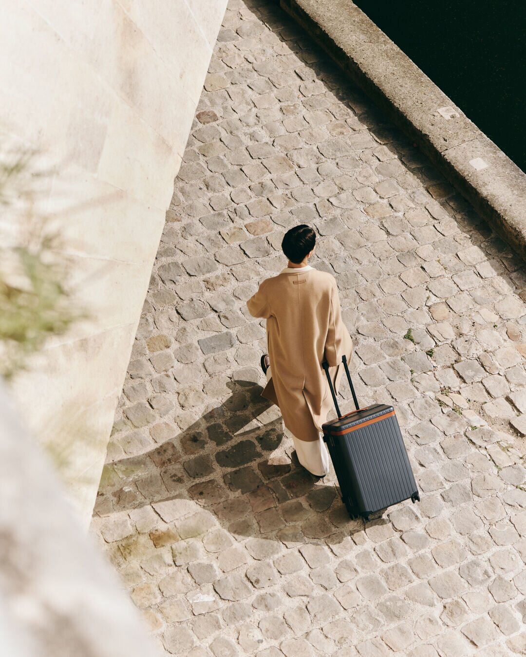
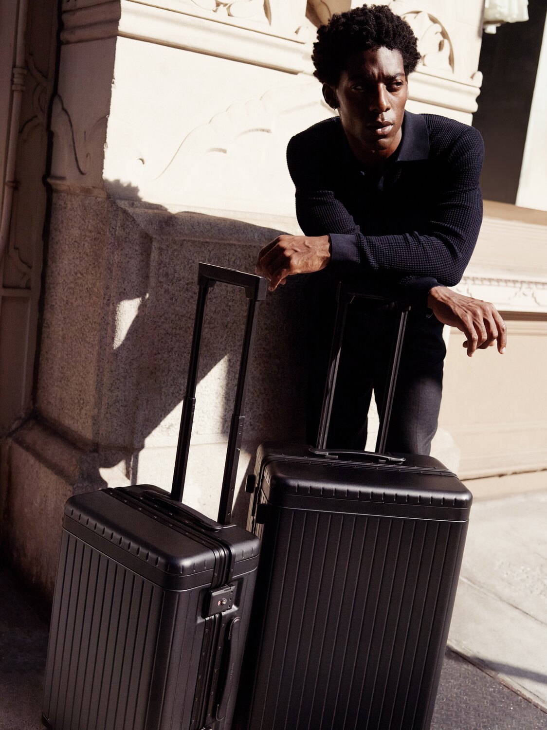
Travel and movement are always prominent, with an increased use of lifestyle imagery making for a more aspirational customer experience.
Product pages have been redesigned to give viewers a better understanding of each product. Components like the vertical sliding carousel reimagine the traditional e-commerce experience for the better. A handy comparison element — debuting soon — will contrast similar products so customers can find the right one for their needs.


The latest product news and travel guides? It's just a sign-up away.